Heat Signatures of War: Professor-Student Collaboration Creates Map of Russian Invasion of Ukraine
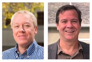
Since Russia’s invasion of Ukraine started on February 24, media outlets have used maps of Ukraine to track the invasion for their viewers. But these visual aids have been troubling for Center for Information Systems & Technology (CISAT) doctoral candidate Will Wagner and his advisor, Clinical Full Professor Brian Hilton.
Why? Because the media’s maps are distorted and seem more like guesswork than an accurate reflection of what’s taking place, they say.
On most of these maps—regardless of the outlet—one sees large swathes of red in Ukraine’s north, east, and south suggesting that the Russians have taken over more than they actually have. Unfortunately, in this fast-moving war, Wagner explains, detailed maps become quickly outdated, leading many media outlets to use graphics that “go wide and general, and [these maps] often fail to capture the back and forth we have seen in this war.”
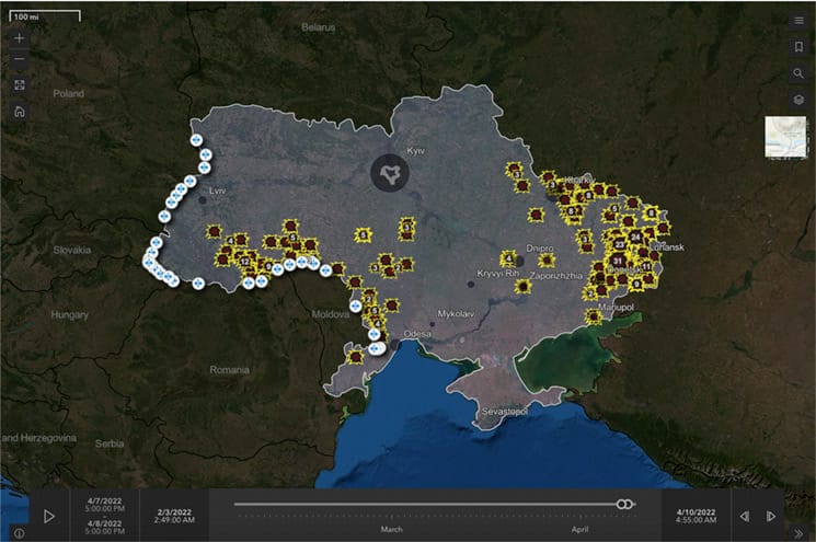
To remedy that problem and provide a more accurate sense of the conflict, Wagner and Hilton have created a free website and app that show the scale of fighting by visualizing the heat signatures recorded by NASA/NOAA satellites.
When Wagner witnessed an in-class demonstration by Hilton of the use of data from Visible Infrared Imaging Radiometer Suite (VIIRS) sensors on the satellites, he had an idea. A CISAT teaching assistant, Wagner suggested to Hilton that they build a site that could be potentially useful for families seeking information.
For anyone checking on relatives in Ukraine, Hilton says, “We expect these visualizations to have an emotional impact.” Years ago, he worked on a similar project related to traffic fatalities across the United States, and “the response was overwhelming.” He expects the same will happen this time as well.
Wagner agrees, adding that they hope their site offers another way for Ukrainians and Russians alike to break through the propaganda that Russia has been spinning about the war and its failures there.
“I think the satellite data shows a relatively non-political way of looking at a very political event,” Wagner says.
A Window on the War
The result of this professor-student collaboration—which is typical of the academic experience of many at CGU—is an interactive experience that allows the user to easily and intuitively grasp not only the scale of the fighting throughout Ukraine since February but also to zoom in and investigate areas that may be of interest.
If, for instance, one wants to know if the Russians have really pulled back from Kyiv, the site can help answer that because it is being updated daily. In addition, the site’s use of a “time slider” enables users to visually understand the answers to that question or another one, such as, “Has the fighting in the East ebbed or increased over the last few days?”
In addition, if someone has friends or family in Ukraine, the site can help give them a picture of where the fighting is relative to their loved ones’ location—even in relation to a specific address.
The site and app can be used on any device, and Hilton and Wagner are keeping it free with no registration or download required to make it easy to access information about the war that will spur honest conversations about the fighting in Ukraine.
What the Map Doesn’t Do
From a technical standpoint, the authors stress that they are not using any sensitive information and that the information should not be considered “military-grade” intelligence.
In fact, visitors to the website will find a list of “nots” that clarifies what the site doesn’t provide with the following language:
- We are not sharing military-grade intelligence. Instead, everything you see here was sourced from publicly available official sources – NASA, NOAA, Esri, and the UNHCR data portal.
- This is not real-time data, and we don’t think it should be. The satellite data provides a snapshot about every six hours. And we delay it a little bit further to assess data quality.
- This data does not assess who or what caused the heat, only that an infrared response (a thermal anomaly) was detected.
- We do not have before and after images. Ukrainian officials have publicly asked that people not share pictures on social media, and we agree with their concerns and will honor that request.
Despite these limitations, the authors point out that the data were reliably created by sensors on the NASA/NOAA Suomi National Polar-orbiting Partnership (Suomi NPP) and NOAA-20 satellites. NASA/NOAA launched these satellites to monitor climate change worldwide, with a range of sensors that monitor things like water vapor and multiple infrared (IR) sensors for monitoring wildfires.
Hilton and Wagner have found an innovative way to take what these satellites were designed to measure—aspects of climate change—and apply them to war. Wagner is especially proud of the data’s objective quality.
“It’s hard to argue with the non-political data coming from a satellite,” he explains. “And when you see it playing out over time, it becomes visceral.”
- Visit Hilton and Wagner’s StoryMap, The War in Ukraine: A Satellite Perspective.
- Visit the standalone WebApp War in Ukraine from an IR Satellite View.
- Visit the university’s Advanced GIS Lab website to learn more about projects and collaborations taking place